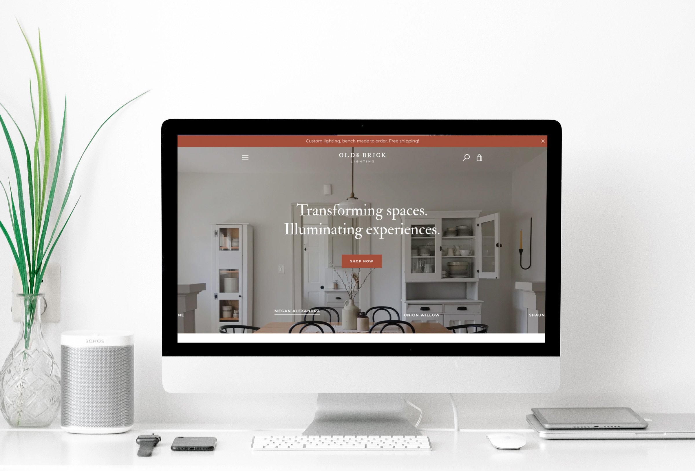
5 Quick Updates to Make Your Website Convert
The average person spends less than a minute on a website, which is why the homepage is such a valuable impression point. People are savvier shoppers and they’ve been trained and empowered to make quick intuitive decisions.
Your target audience should feel seen, heard, & championed. Use language that targets their core need, and how you’ve identified them - based on how they see or want to see themselves.
0 1 Have a clear brand or connection statement on your home page
This is our strategy for crafting an effective brand or connection statement:
Tip: Not sure how to craft an effective brand statement? Read our Building an Effective Brand Statement article.
0 2 Have a clear call to action
Think of a CTA as ‘next steps’ - from the information you’ve provided what should they do next? An easy example would be Shop, Get In Touch, Learn More, etc.
Tip: We like to use a strategy of problem + solution when crafting our content. Clearly lay out the problem, and how you solve it and have your CTA invite them to solve it with you.
0 3 Highlight 3-4 bullet points of your stand-out benefits or products
Very clear and concise, as few words as possible.
Tip: We love doing this with brand-customized icons.
0 4 Optimize your website for mobile
It's crucial to optimize your website for mobile view. Research has shown that over 50% view a website on a phone.
0 5 Have intuitive organization + navigation
Tip: Think fewer clicks, and set up for mutual goals. What do they want/need?
Note: the temptation is to talk about your organization and what you can do for them - but try to put yourself in the target audience’s shoes. Speak to where they want to be/go and then offer up the solution secondary. Don’t underestimate intuition and the value of being seen - it builds trust.


