
The Lincoln Shoe Company, hailing it’s name from the building that originally was the Badorf Shoe Co. from the 1930s, is evolving into a boutique event space with a capacity of 125-150 people. It aims to offer an intimate, vintage experience for events like weddings, conferences, and corporate parties.
IDENTITY ELEVATION PACKAGE
COLLATERAL DESIGN
HOW WE DID IT ↓
The goal is to develop a brand identity that resonates with its history and values, targeting clients seeking quality experiences at reasonable prices.
HISTORIC NOSTALGIA
EMPOWERING COMMUNITY
MEMORIES & CONNECTION
MODERN COMFORTS
TIMELESS HOSPITALITY


LOGO FORMATS
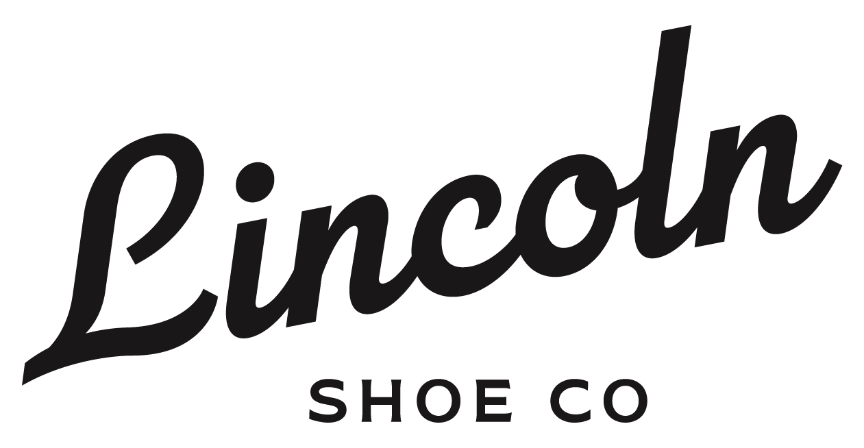
PRIMARY
Inspired by the typefaces of the era, the simplicity of the customized script font creates space for the rhythms of connection.
The upward slant of the word lockup symbolizes energy and movement toward the future and sustainable community. It is balanced with the horizontal text, which is more grounded and traditional.

SECONDARY
A unique and bold variation to embody a sense of empowerment and heritage. The weighted, almost serif-like flared strokes add a touch of tradition and legibility. The curved accents mirror the primary logo and add an accent of growth and movement.
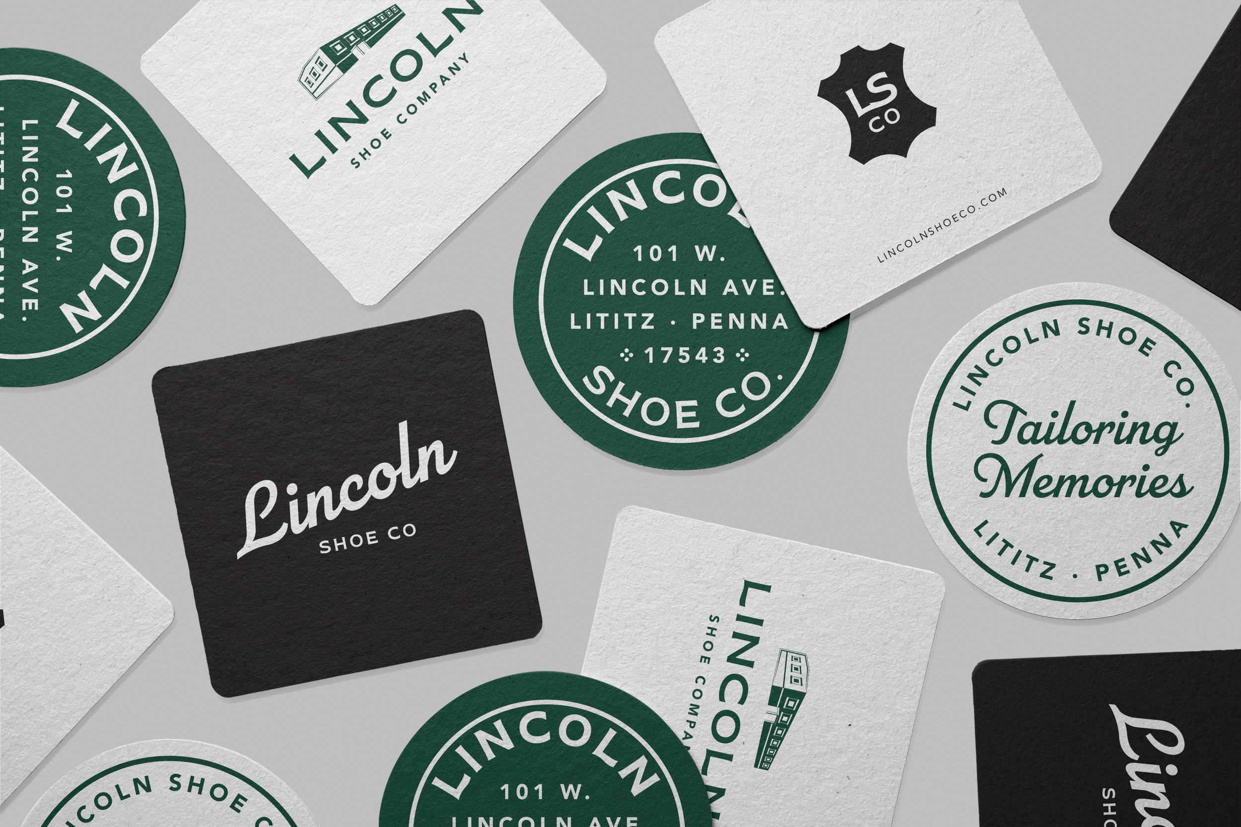
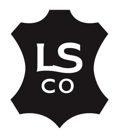
SUBMARKS & ICONS
Our approach was to include subtle symbolism and echoes of the shoe company namesake while not overtly referencing shoes.
We included a variety of shapes and lockups to add versatility across applications while remaining consistent with the branding.


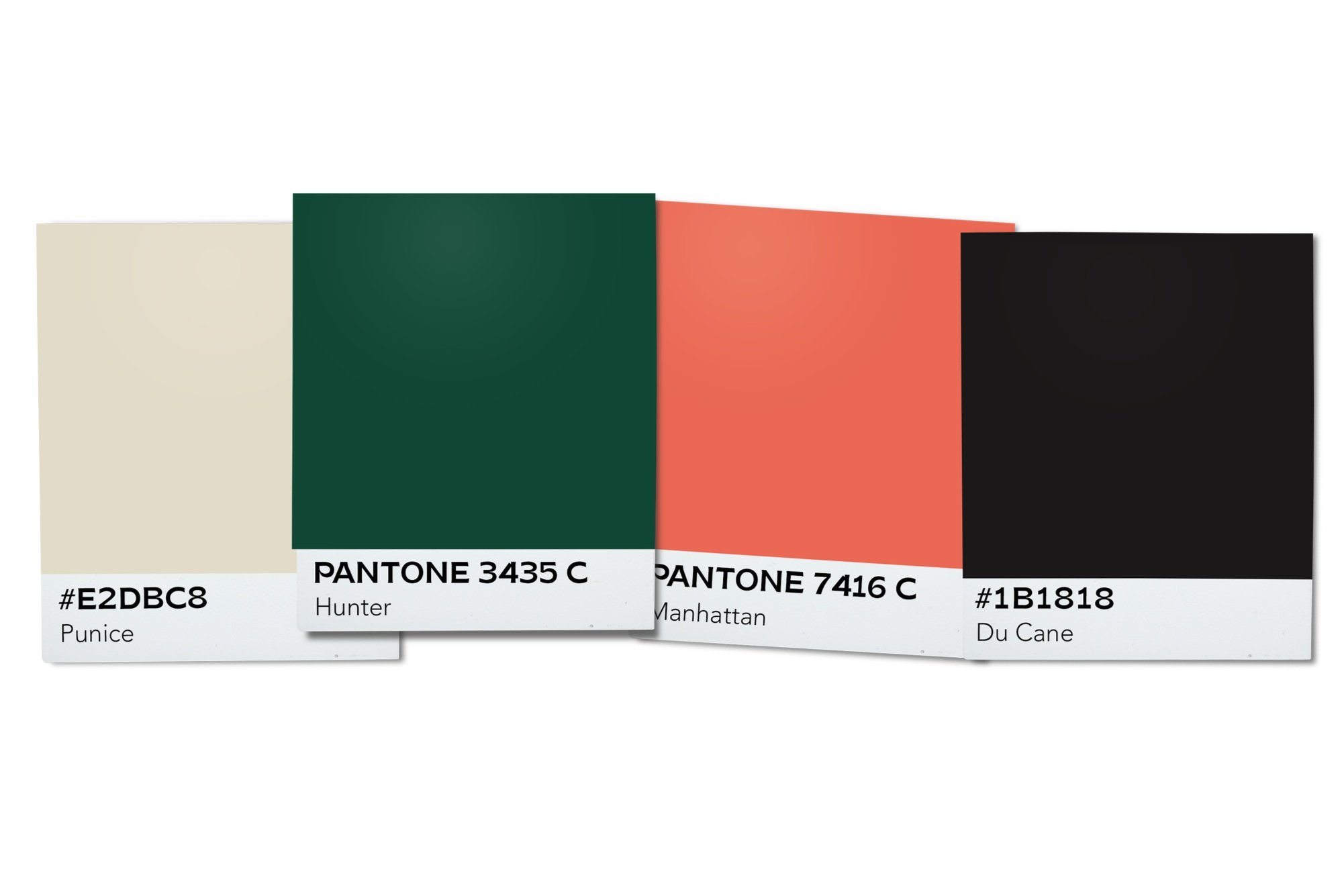
COLOR PALETTE
The 1930s, marked by the Great Depression, saw surprisingly light-hearted color choices in art, fashion, and other media despite the era's challenges.
The selected color palette employs a hospitable, sophisticated, and historically grounded scheme that speaks to both the time-honored charm and modern refinement of the brand.
The deep, muted tones with a vibrant pop of color reflect the building’s vintage roots, offering a nod to the 1930s aesthetic.

TYPOGRAPHY
The 1930s was a period of significant cultural growth, with typography reflecting the era's artistic and socio-economic climate.
Title The bold, flared strokes and curvy letters of Brice embody a sense of empowerment and community, mirroring the brand's core values. Its unique style creates a feeling of exclusivity and comfort that bridges a gap between nostalgia and contemporary aesthetics
Heading Inspired by lettering styles of the 1930s and 1940s, the script aligns perfectly with the brand’s historical essence. The parallel lines, recurring shapes, and structured rhythm all visually forge connection.
BOdy An authentic 1920s typeface that is an organic interpretation of the geometric style blending modern readability and echoing the brand’s legacy. Its circular shapes are inviting, fostering a sense of warmth and approachability providing a seamless, engaging experience.


