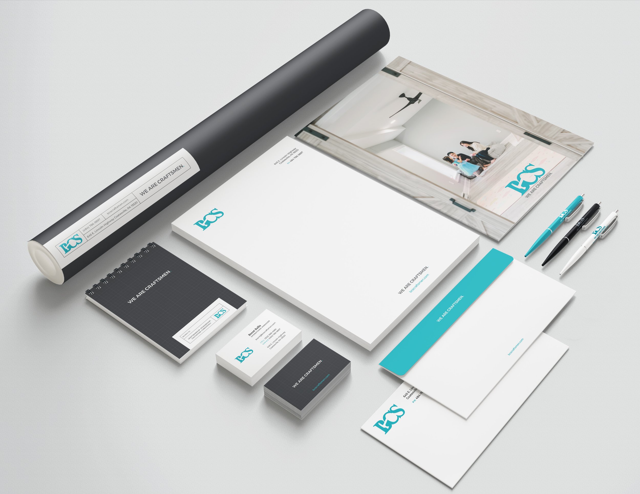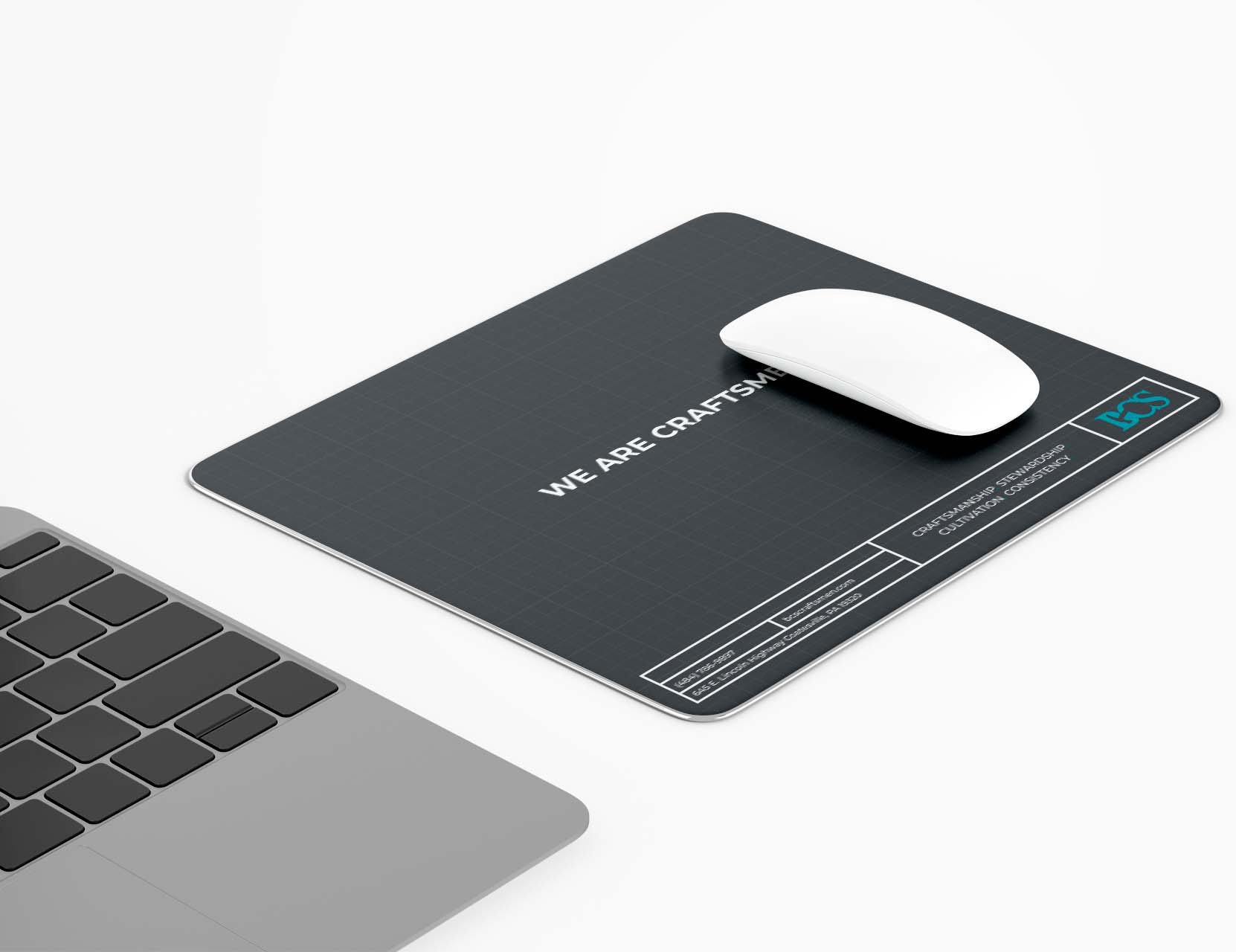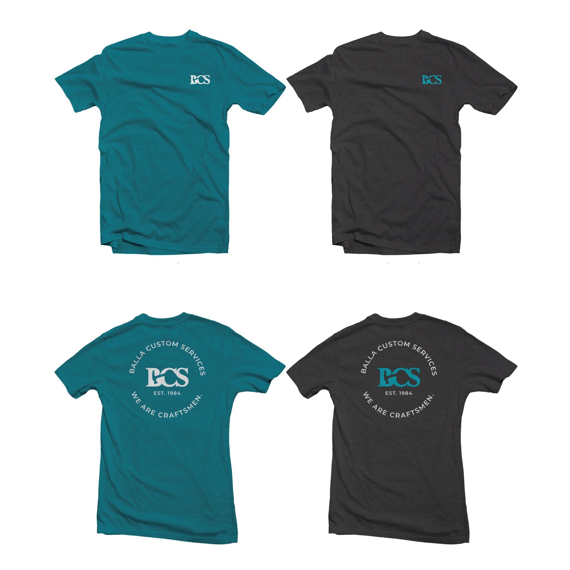
Tailor-Built Spaces Designed For Intentional Living + Connection. As a company with many years of experience, BCS reached out to us to create a brand story, visual identity, and update their online presence. We provided creative direction to develop a look and feel that matches their craftsmanship, creates space for their aspirations, and inspires confidence in their target audience.
CREATIVE DIRECTION
IDENTITY ELEVATION
STORYTELLING
WEB DEVELOPMENT
COLLATERAL DESIGN
APPAREL DESIGN
LOGO FORMATS


PRIMARY
The logo variation is the stylized initials only. This is used as an alternative for primary positioning to give flexibility in space limitations (i.e. in small formats, icon, return address on envelopes, etc.). Original file should be used to mantain ratio, appropriate baseline and fonts. Logo should primarily be depicted in color or grayscale when on white background and in white when on background colors or images.
SECONDARY
The full logo includes the stylized initials integrating a hammer with the tagline. This is used for primary applications, for example on an introduction page or first impression. Original file should be used to mantain ratio, appropriate baseline and fonts. Logo should primarily be depicted in color or grayscale when on white background and in white when on background colors or images.

Icon
The logo variation is the stylized initials only. This is used as an alternative for primary positioning to give flexibility in space limitations (i.e. in small formats, icon, return address on envelopes, etc.). Original file should be used to mantain ratio, appropriate baseline and fonts. Logo should primarily be depicted in color or grayscale when on white background and in white when on background colors or images.

Tagline
The tagline is written out in Montserrat Bold. It can be used as a standalone secondary brand element as long as the primary brand is evident or implied. When used as a standalone element the period can be stylized with the BCS teal.

TYPOGRAPHY
These brand fonts can be used to extend the identity system for BCS. PT Serif must only be used for headlines and display uses, while as Montserrat can be used for copy blocks as well as headlines.
PT Serif
Stability
Consistency
Credibility
Montserrat
Timeless
Modern
C O L O R P A L E T T E
The primary color is a bright teal with accents of dark teal and a range of gray neutrals to create a sturdy base and help balance the vibrancy. The palette was chosen to project feelings of trust-worthiness and established balanced with innovative and people-first approachability.


